
Figure 1.
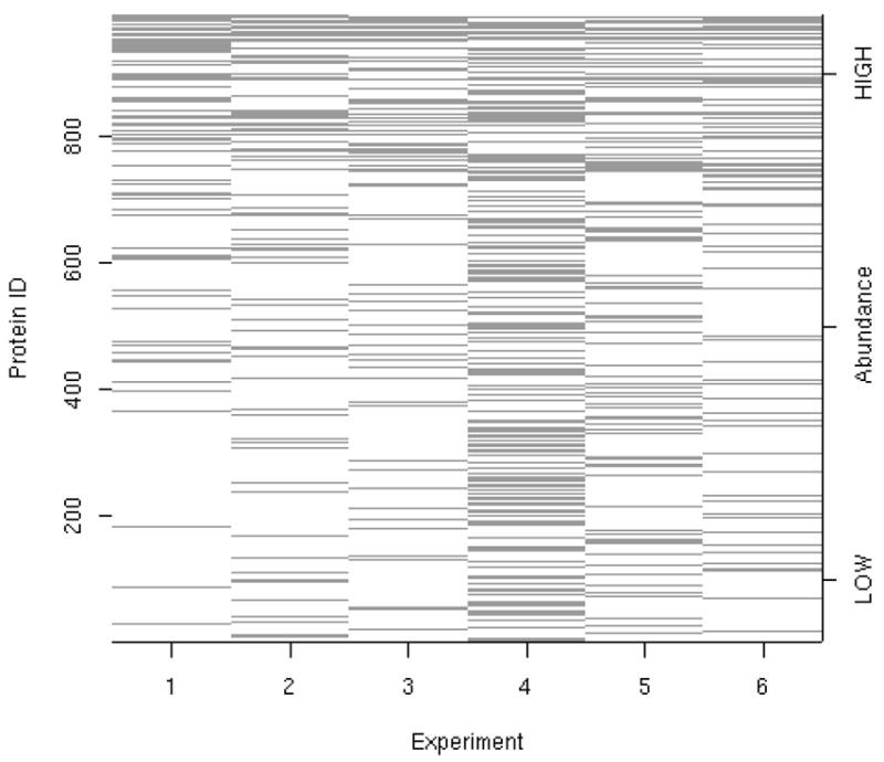
Protein coverage across all six iTRAQ™ experiments. The horizontal axis indicates experiment run order. The vertical axis indicates proteins, where proteins are ordered by their average abundance rank across each experiment. Each horizontal line represents the presence of a protein within each experiment. The proteins at the top of the plot have highest average abundance and those at the bottom of the plot have the lowest average abundance. A protein present in all six experiments would show as a black horizontal line across the entire plot. Note that many more proteins were detected in experiment 4 than in the other five experiments. Due to thresholding which occurs during mass analysis, not all proteins will be observed in all experiments.