
Figure 3.
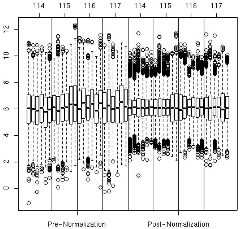
Box and whisker plots of peptide abundance on the log base 2 scale for each experiment-by-tag combination pre-normalization (left 4 panels) and post-normalization (right 4 panels). The vertical axis is the log base 2 abundance values. The horizontal axis corresponds to experiment and tag combination. The sort order of the box plots are first by tag and then by experiment. For example, the first six box plots are from tag 114 in experiments 1 through 6, the next six are from tag 115 in experiments 1 through 6, etc. The top and bottom of the box represent the 75th and 25th percentiles of the distribution, respectively, and the line inside the box denotes the median. The ‘whiskers’, or dashed lines and dots indicate data points on the extremes of the distribution. Much of the variation between experiment-by-tag combinations was removed via the normalization model.