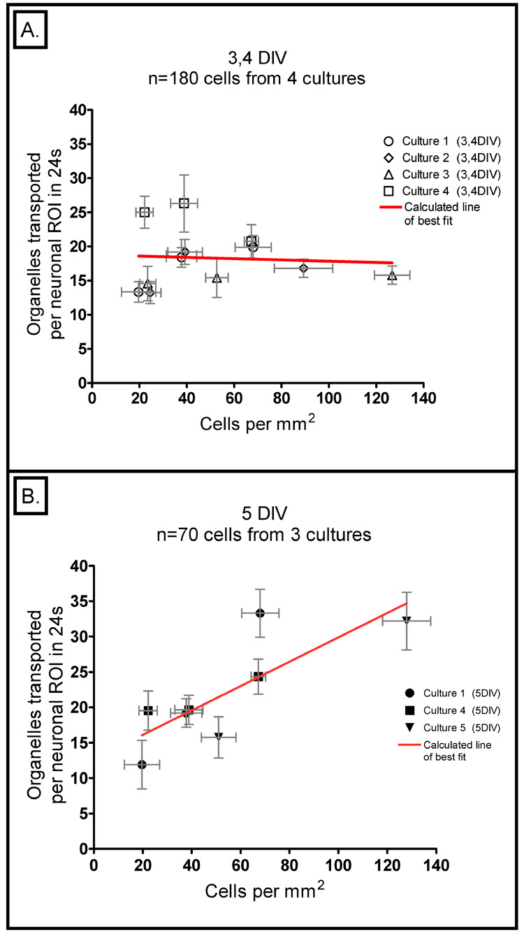
2. Plot of the number of transported organelles versus cell density.
A) At 3 – 4 DIV, the data fall on a line with a slope that is not statistically different from zero (p-value = 0.83) and there is an extremely poor fit to for this regression (r2=0.00). This graph represents a total of 180 neurons from 3 and 4 DIV; these data were gathered from four different cultures. In both panels of this figure, each data point represents the average of all the neurons from a single density category (Low, Medium, or High) from a single culture; the horizontal error bars reflect the standard error of the mean (SEM) of cell density and the vertical ones reflect the SEM of the number of transported organelles observed. B) The same analysis at 5 DIV provides data that fall on a line with a slope that is significantly different from zero (p-value = 0.018) with a much higher correlation (r2=0.635). This graph represents a total of 70 neurons from three different cultures.

