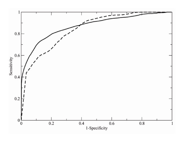
Figure 1.
ROC curves. The solid line shows a ROC curve obtained by comparing 149 CATH domains with 29 098 CATH entries of the first dataset of Table 1 that contains large protein domains; the dashed line represents a ROC curve calculated for the 42 small CATH domains and 4 937 CATH entries of the second dataset of Table 1, containing small protein domains.

