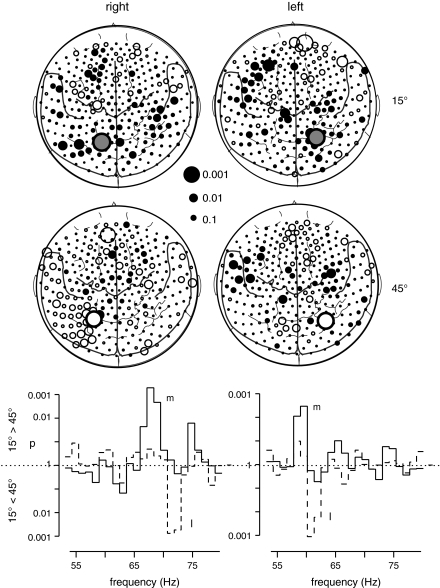
Figure 3.
Comparison of oscillatory responses to S1 stimuli at 15° versus 45° for both groups (left column: group R with stimulus presentation in the right hemifield and right column: group L with stimulus presentation in the left hemifield). The maps depict the topography of GBA differences between both S1 stimuli in the frequency ranges, where the statistical probability mapping had revealed significant effects (top left: 68 ± 1.5 Hz, bottom left: 72 ± 1.5 Hz, top right: 59 ± 1.5 Hz, and bottom right: 62 ± 1.5 Hz). Each circle represents one of the 275 MEG sensors projected onto a 2-dimensional cortical surface map with some major anatomical landmarks (dorsal view, nose up). The size of each circle reflects the statistical strength of the GBA difference between both S1 stimuli. Filled circles symbolize relative spectral amplitude increases in response to 15° stimuli, whereas open circles stand for relative spectral amplitude enhancements for 45° stimuli. The circles with the bold borders represent the sensors with the most robust GBA differences between stimuli, that is, where the statistical criterion was fulfilled for 2 neighboring frequency bands. The more medially located sensors showed a preference for 15°, the more lateral sensors for 45° stimuli.
The graphs at the bottom show the results (p values) of t-tests comparing spectral amplitudes between both S1 stimuli at the 2 sensors showing the most pronounced effects. The solid line gives p values for the comparison of S1 at 15° versus 45° at the more medial sensor (m) responding more strongly to S1 at 15°, whereas the dotted line represents p values for the opposite contrast (plotted downwards) at the more lateral sensor (l) responding more strongly to S1 at 45°.

