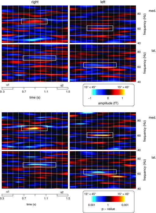
Figure 4.
Time-frequency plots depicting the spectral amplitude values and statistical strength (top and bottom panels, respectively) of differences between 15° and 45° sample stimuli (warm colors: relative increases for S1 at 15°, cold colors: relative increases for S1 at 45°) for both groups. Data are shown for the interval from the onset of S1 to the offset of S2 and for frequencies between 40 and 90 Hz. The top left graphs in each panel depict activity differences at the more medial posterior sensor for group R (med., symbolized by the largest circle in the top left map of Fig. 3), the bottom left graphs show activity differences for the more lateral parieto-occipital sensor for group R (lat., symbolized by the largest circle in the bottom left map of Fig. 3). The plots in the left half of the figure show the corresponding sensors for group L. Effects that met the statistical significance criteria described in the Materials and Methods are marked with white rectangles.

