
Figure 2.
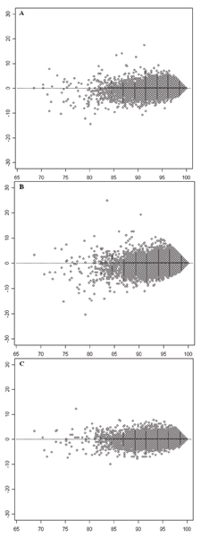
MA-like plots for comparing call rates of SNPs between two experiments with different batch sizes. The empty circles depict 500,568 SNPs. The x-axes represent average call rates of individual SNPs in two experiments with different batch sizes. The horizontal dotted lines indicate the expected locations of SNPs where the call rates in the two compared experiments were exactly same. A: Comparison between BS1 and BS2. The y-axis represents call rate in BS1 – call rate in BS2. B: Comparison between BS1 and BS3. The y-axis represents call rate in BS1 – call rate in BS3. C: Comparison between BS2 and BS3. The y-axis represents call rate in BS2 – call rate in BS3.