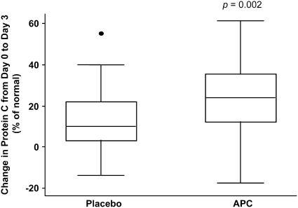
Figure 2.
Change in protein C levels by treatment group. The horizontal line within the box represents the median, the boxes encompasses the 25th–75th percentile, and the whiskers encompass the 10th–90th percentile (solid dot is an outlier). Units for protein C levels are % of normal, so the y axis represents the change in protein C levels expressed as % of normal. There is a difference in the change between baseline and Day 3 levels in the activated protein C (APC)–treated group, compared with the control group, P = 0.002.

