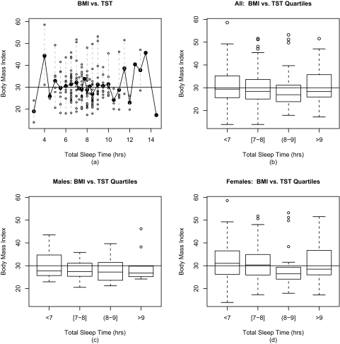
Figure 1.
In Figure 1a, the individual BMIs are plotted versus the TSTs in open circles. The mean BMI for each TST value is plotted in black; the BMI range for each TST value is marked by a dashed grey line. In Figure 1b, boxplots illustrate the BMI distribution for each TST quartile for all patients. The top of the box is the 3rd quartile BMI; the black line across the box is the median BMI; and the bottom of the box is the 1st quartile BMI. Outliers are plotted as circles. Figure 1c and Figure 1d illustrate the BMI distributions for each TST quartile for men and women respectively. In all four subfigures, a horizontal line is graphed at BMI = 30 kg/m2, the obesity cut point.

