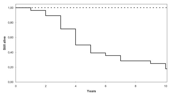
Figure 4.
Kaplan-Meier survival curves over time for the patients included in this study. The correlation-based classifier classified the tumours into a "good prognosis group" and a "bad prognosis group". These Kaplan-Meier curves visualize the survival rate in the two groups the first ten years after diagnosis. The dashed line represents the good prognosis group and the black line represents the bad prognosis group.

