
FIGURE 4.
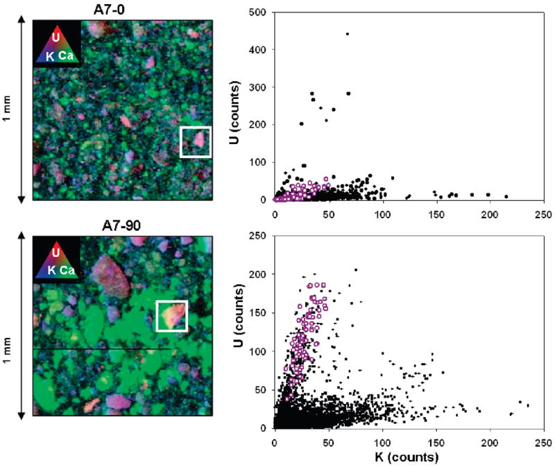
(Left) Tricolor X-ray fluorescence plots of U, Ca, and K in A7-0 and A7-90. Purple color represents the association between U and K. White boxes represent uranium “hot spots”. Green represents Ca. (Right) Correlation plots of U and K. Black dots represent all data (n = 25,000) where white circles represent U–K correlation at “hot-spot”.