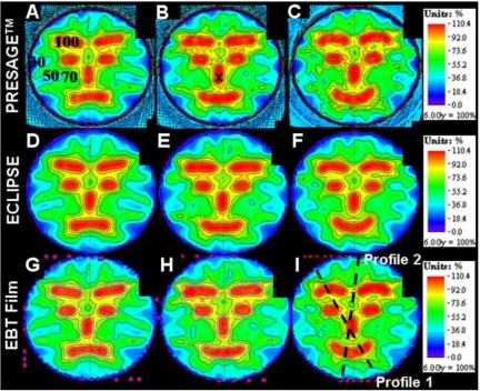
Figure 4.
Comparison of dose distributions in the three selected slices (see Fig. 1) between PRESAGE™, ECLIPSE®, and EBT film. The first row images [(a)–(c)] are dose distributions from PRESAGE™. The second [(d)–(f)] and third [(g)–(i)] rows are corresponding images from the ECLIPSE® and EBT distributions. The cross mark in (b) indicates the point where the dose distributions were normalized to convert to relative dose. The percent isodose lines (100%, 90%, 80%, 70%, 50%, and 30%) are superimposed onto the dose maps to aid comparison.

