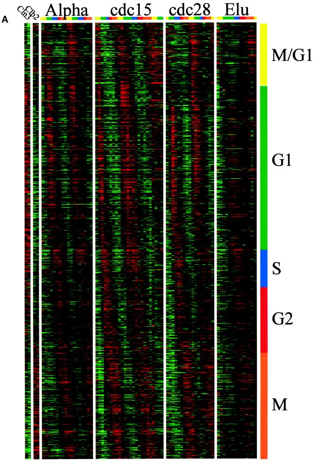
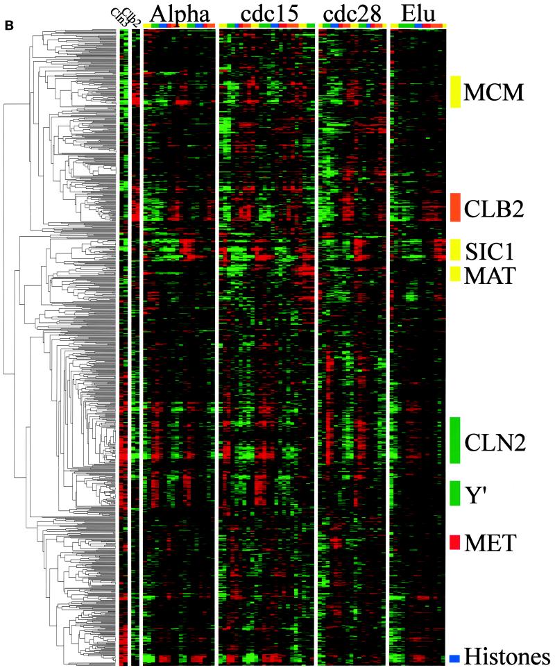
Figure 1.
Gene expression during the yeast cell cycle. Genes correspond to the rows, and the time points of each experiment are the columns. The ratio of induction/repression is shown for each gene such that the magnitude is indicated by the intensity of the colors displayed. If the color is black, then the ratio of control to experimental cDNA is equal to 1, whereas the brightest colors (red and green) represent a ratio of 2.8:1. Ratios >2.8 are displayed as the brightest color. In all cases red indicates an increase in mRNA abundance, whereas green indicates a decrease in abundance. Gray areas (when visible) indicate absent data or data of low quality. Color bars on the right indicate the phase group to which a gene belongs (M/G1, yellow; G1, green; S, purple; G2, red; M, orange). These same colors indicate cell cycle phase along the top. (A) Gene expression patterns for cell cycle–regulated genes. The 800 genes are ordered by the times at which they reach peak expression. (B) Genes that share similar expression profiles are grouped by a clustering algorithm as described in the text. The dendrogram on the left shows the structure of the cluster.


