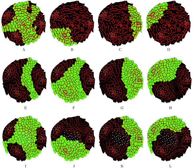
Figure 8. Influence zone analysis.
The influence zones calculated for the central zone (first column), P 0 (second column), P 1 (third column), P 2 (fourth column) in real and simulated maps. (A–D) show the influence zones in a real map. (E–H) show the influence zones in digitized maps where PIN labelling was calculated based on the flux-based hypothesis. In this simulation, cells in the central zone are identical to other cells. Primordia (blue cells) are perfect sinks. (I–L) shows a simulation based on the flux-based polarization hypothesis, but here both primordia and cells in the central zone (white cells) are removing auxin. Note that qualitatively the last simulation shows a better match with the original real map.

