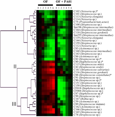
Figure 3. Cluster representation of the three OF infection classes.
The survival curve of each OF infection alone was compared to the survival curve of flies feeding on 5% sucrose. The survival curves of the OF PA01 co-infections were compared to the survival curve of PA01 alone. Green boxes indicate time points where fewer flies were alive as compared to controls; red indicates time points where more flies were alive as compared to controls. The data was collected from six independent infections with a minimum of 25 flies per infection. The * indicate infections that were further characterized.

