
Figure 3.
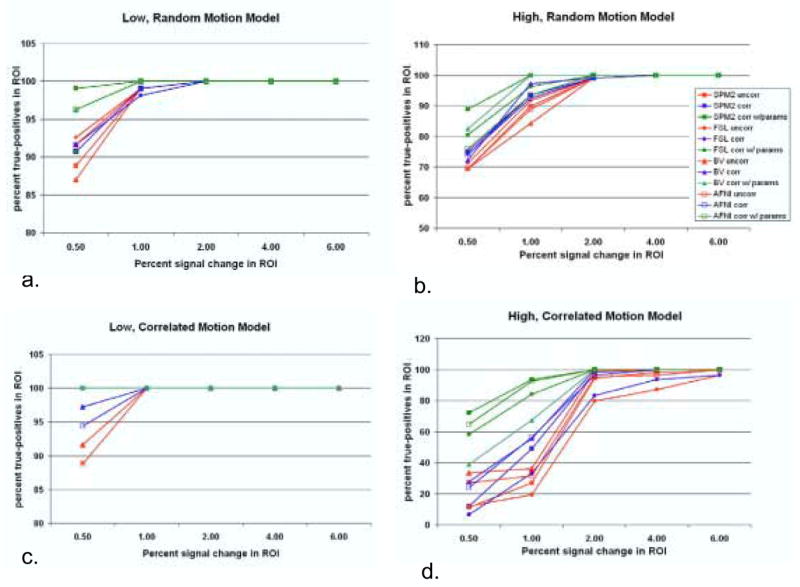
Sensitivity analysis at 1% false-positive rate in a) Model 1 (low, random motion), b) Model 2 (high, random motion), c) Model 3 (low, correlated motion), and d) Model 4 (high, correlated motion). Each line represents the average of three phantoms analyzed with the specific package with the specific analysis type. At each level of percent signal change, two regions of activation are averaged. The UNCORR results are shown in red lines, the CORR results in blue lines and the CORR WITH PARAMS in green lines. The SPM2 results are shown in closed squares (▪), the FSL in closed circles (●), the BV in closed triangles (▴) and the AFNI in open squares (□).