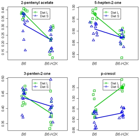
Figure 4. Distributions of the intensities for the top-ranked compounds affected by MHC types.
Each panel displays normalized intensity values (y-axis) for a single metabolite affected by MHC types. MHC type is given on the x-axis, and different diets are distinguished by color and plotting character (green square for Diet L; blue triangle for Diet S). A line connecting average responses for each MHC type is shown separately for Diet L (green) and Diet S (blue).

