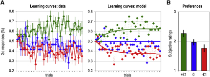
Figure 2.
Behavioral Data
(A) Learning curves. Colors indicate cues for which button presses are rewarded (green), neutral (blue), or punished (red). Diamonds represent, across trials, percentages of subjects that pressed the button. Left: continuous lines join the diamonds to illustrate actual choices made by subjects. Right: continuous lines represent the probabilities of button press estimated by an optimized Q-learning model.
(B) Preferences. After the conditioning phase, cues were unmasked and subjects rated them, from the most (3) to the least liked (1). The graph shows the average rating for reward (green), neutral (blue), and punishment (red) cues. Bars are ± intersubjects standard errors of the mean.

