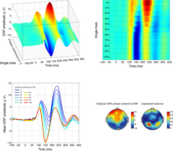
Figure 5.
Modelled data and topographical maps from session 1 of subject RXL in Experiment 1. The upper part of the figure shows 3D (left) and 2D (right) representations of single trials, sorted by chronological order in which they were recorded during the experiment, independently for each bin of phase coherence. In the lower left corner, single-trial modelled data were averaged according to phase coherence level, and colour coded from blue (0%) to red (100%) following Figure 4 nomenclature. The data are from the electrode at which the maximum R2 was obtained. The topographic maps show the interpolated ERP signal (left, in μV) and explained variance (right, in %) at the latency of maximum R2 (148 ms). The electrode showing the best fit is at the centre of the lower left red cluster in the explained variance map. For this subject, the electrode showing the maximum N170 was over the right hemisphere. However, at this electrode, the pattern of model fit was virtually indistinguishable from the one showed here.

