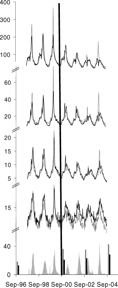
Figure 1. Study Outcome Rates over the Study Period Demonstrating Year-to-Year Variability in Mortality and Health Care Use, Temporal Correlation with Ontario Influenza Viral Surveillance Data, and Increasing Influenza Vaccination Rates Demonstrating Greater Increases in Ontario Compared to Other Provinces Combined.
Event rates (from top to bottom) for doctors' office visits, ED use, hospitalizations, and mortality (grey lines are for Ontario and black lines are for other provinces combined) are expressed as rates per 100,000 on the upper sections of the vertical axis. Viral surveillance data (grey shaded areas) are expressed as the weekly percentage of tests positive on the lower section of the vertical axis. Vaccination rates for the household population aged ≥12 y (grey vertical bars are for Ontario and black vertical bars are for other provinces combined) are expressed as the percentage of the population vaccinated on the lower section of the vertical axis. The horizontal axis represents time. The black vertical line represents UIIP introduction.

