
Figure 6. Decision curve for a theoretical distribution.
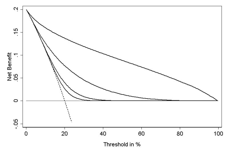
In this example, disease incidence is 20%; the predictor example is a normally distributed laboratory marker. Thin line: assume no patient has disease. Dotted line: assume all patients have disease. Solid lines: prediction model from a single, continuous laboratory marker: from left to right, the lines represent a mean shift of 0.33, 0.5, 1 and 2 standard deviations in patients with disease.