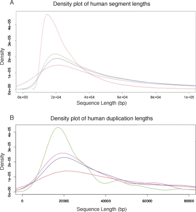
Figure 3.
Density plots of the length of segments in the Enredo graph. (A) Red line, the distribution of segment lengths in the original graph; green line, the graph after applying joining and annealing up to edit distances of 4; blue line, the graph after removing splitting small edges; magenta line, the final graph, after resolving circular segment paths, removing the retrotransposed pseudogenes and validating the bridging edges. The peak of ∼10 kb interanchor distance is rapidly converted to a broader distribution of segment lengths, with the mode slightly longer (∼20 kb). The weighted median (N50) is considerably longer (∼230 kb). (B) The distribution of human segment lengths in the final Enredo graph where the segment has one, two, three, or four or more copies in human. The plot, therefore, contrasts human single-copy regions vs. regions possessing duplications of different degree.

