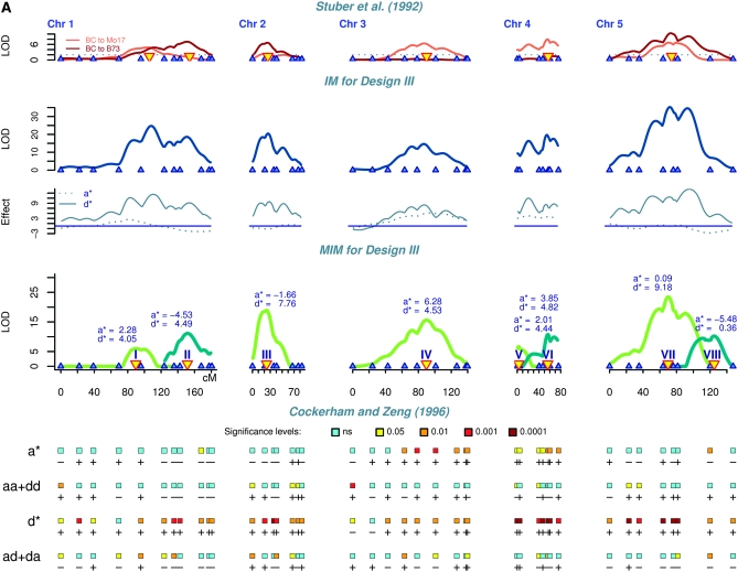
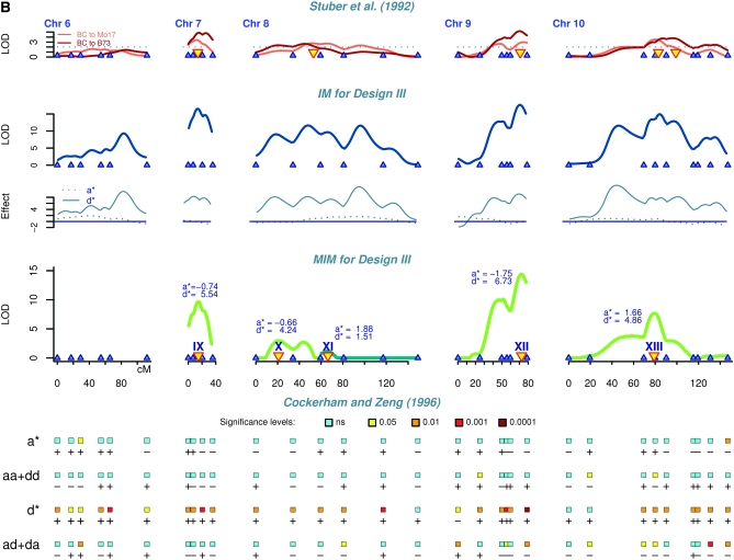
Figure 1.—
Genetic mapping results of the maize data for grain yield (bushels/acre) (A) for chromosomes 1–5 and (B) for chromosomes 6–10. The results are shown for comparison by using four statistical methods: (1) interval mapping (IM) for each backcross (Stuber et al. 1992), with LOD threshold 2 (the identified QTL are indicated by yellow triangles); (2) interval mapping for design III showing augmented additive (a*) and augmented dominance (d*) effects; (3) multiple-interval mapping for design III indicating QTL number, effects, and positions; and (4) single-marker analysis of the four contrasts proposed by Cockerham and Zeng (1996). Each line corresponds to one contrast with effects indicated on the left. The rectangles correspond to the marker loci and their colors represent the P-values. Plus and minus signs indicate the direction of effects.


