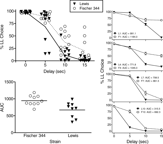
Fig 1.
Upper left panel: Individual percent choice of the LL alternative plotted as a function of LL delay value. Mean percentages are connected by solid (Lewis) and dashed (F344) lines. Lower left panel: Area under the curve for individual rats within each strain. Right panels: Average choices of individual rats rank-ordered by AUC value. Top panel shows rats with the highest AUC, and lower panels show rats ranked 4, 7, and 10 (of 10 rats within each strain), respectively. In all panels, Lewis rats are depicted as filled triangles (▾) and F344 as open circles (○).

