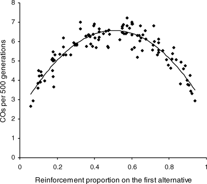
Fig 2.
Average number of changeovers (COs) per 500 generations plotted against the average reinforcement proportion obtained from the first alternative. Data from all repetitions of the canonical experiment are plotted. The smooth curve is the best-fitting quadratic polynomial, which simply illustrates the trend.

