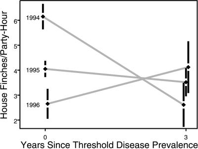
Figure 3.
Changes in house finch abundance in the three groups of 2° × 2° blocks where threshold disease prevalence was reached in 1994, and the first halves of 1995 and 1996. Abundance (± 1 SEM from an ancova) of house finches is plotted as birds per party per hour (from CBC) immediately before and three years after regional prevalence of conjunctivitis reached 20%. The significant interaction term (see text) reflects the existence of significant differences in abundance before the epidemic, but the absence of significant differences 3 years later.

