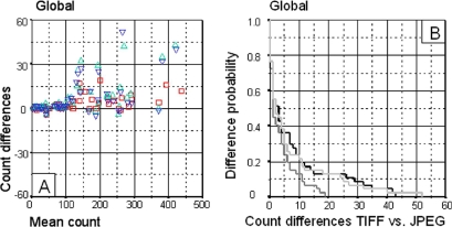
Figure 1.
Global results obtained by automatic quantification. The Bland-Altman graph (A) represents the difference between each pair of results (Y axis) and the mean of both counts (X axis) for each comparison. The Kaplan-Meier curves (B) represent the conditional probability of observing differences between the TIFF and the JPEG images at different levels of compression. The X axis represents count differences between the number of nuclei in TIFF and JPEG images at 3×, 23× and 46× compression. The Y axis represents the probability of observing these count differences. A. Superimposed Bland-Altman graphs comparing count differences between TIFF and JPEG images. TIFF vs. 3× compression JPEG (□), TIFF vs. 23× compression JPEG (▵), TIFF vs. 46× compression (▿). B. Superimposed Kaplan-Meier curves comparing the probability of difference between TIFF and JPEG image counts. TIFF vs. 3× compression JPEG (▩), TIFF vs. 23× compression JPEG (▪), TIFF vs. 46× compression JPEG (□).

