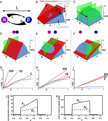
Fig. 4.
Mathematical model of a two-species syntrophic community. In all panels, the green plane represents the concentration of nutrient B at species α, [B]α; the blue surfaces and curves represent the production rate of nutrient A; the red plane and lines represent the total rate of consumption of A; and the gray planes and lines represent the rate of consumption of A by species α only. (A) A schematic diagram showing that colony α produces nutrient A and colony β produces nutrient B, establishing gradients over the distance between the colonies L (m). The thickness of the arrows represents the continuous change of concentrations of A and B. (B) 3D rate plot of changes of consumption of A as a function of L. (C) 3D plot of changes in [B]α as a function of L. (D–I) 3D rate plots and 2D sections of the state of the community when colonies of species α and β are separated by small (D and G), intermediate (E and H), and large (F and I) L. The steady-state concentration of nutrient A occurs where the consumption and production curves intersect, shown by the dashed white line in E and F, at the given concentration of nutrient B. (D–F) 3D rate plots from a Class II community predict a non-zero steady state only at intermediate L, indicating that the synthetic community experimentally tested here is Class II. (G–I) 2D sections of representative production and consumption curves for Class I, II, and III communities. (J and K) Steady-state concentrations of A and B and colony sizes of α and β as a function of distance parameter d; see SI Text for details.

