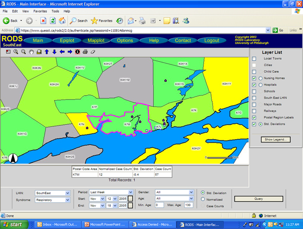
Figure 4.

RODS Mapplot function of sample data – FSA counts colour coded; layers added. Figure 4 is a Mapplot of the Kingston, Ontario, region by FSA, with a single region selected (outlined in pink). Respiratory syndrome count magnitude, where applicable, is colour coded into FSA boundaries. Additional layers include: nursing home, and hospital locations.
