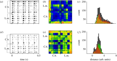
Figure 3.
Comparison between spike trains of two neuron types, in two species: (a–c) TN1 and (d–f) AN12. (a,d) Raster plots of spike trains for the male song pattern as stimulus. (b,e) Corresponding spike train distances. (c,f) Distributions of spike train distances. (a) Data of six specimens of TN1 in C. biguttulus (C.b.) and five specimens in L. migratoria (L.m.; eight stimulus presentations per neuron). (b) Metric distances between all spike trains in a colour-coded diagram. Dark purple and blue indicate low distances (=high similarities), while yellow to orange indicate large distances (dissimilarities) between spike trains. The small squares represent the comparison between two cells (or, on the diagonal between the eight spike trains produced by one cell; cf. figure 2c); data points within the lower left large square marked by black lines represent comparisons between all TN1 specimens recorded in C. biguttulus, and those in the upper right square represent the intraspecific comparison for the locust. The 5×6 block on the upper left shows the comparison between the two species. Dark purple, 0; blue, 2; green, 4; orange, 6. (d,e) Same evaluation for the AN12 neuron as in (a,b). Dark purple, 0; blue, 1; green, 2; orange, 3. (c,f) Comparison of the distance distributions for C. biguttulus (orange) and L. migratoria (green), and for the interspecific comparison (black). See text for further explanations.

