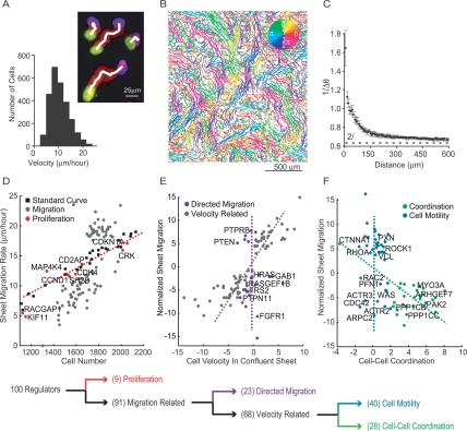
Figure 3.
Sequential decision tree analysis to functionally cluster siRNA perturbations. (A) A series of superimposed images of migrating cells with the initial position in yellow, final position in blue, and intermediate positions in red (nuclear marker). The white line marks the output of the tracking algorithm. The histogram illustrates the distribution of individual cell velocities within the sheet. (B) Cell tracks from an intact monolayer imaged every 20 min for 16 h and colored according to the direction of movement. (C) Quantification of coordinated cell movement. The graph shows the inverted, angular difference between cell pairs as a function of distance between the pairs (five repeats; error bars represent standard error). The dashed line at 2/π represents the threshold for random movement. (D) Effect of cell density on sheet migration. White squares show migration rates measured for control cells plated at different densities. The red dashed line represents the best linear fit to these control measurements (r-squared = 0.97). Sheet migration rates are plotted as a function of cell number for validated hits (n = 4; gray and red dots). Gene perturbations that lie within two standard deviations of the control line were considered density-dependent and marked as red dots. (E) Remaining siRNA targets were tested for a possible role in directed cell migration. Sheet migration rate is plotted as a function of average individual cell velocity within an unperturbed monolayer for each migration-related siRNA perturbation (normalized values). The gray line approximates the correlation axis between cell velocity and sheet migration. Velocity-independent regulators, whose effect on single cell velocity was within two standard deviations of control values, are shown in purple (directed migration module). (F) Remaining velocity-related siRNA knockdowns were classified into cell–cell coordination and cell motility modules. Sheet migration rates are plotted as a function of directional correlation. Genes that enhance or suppress directional correlation are marked in green (cell–cell coordination module), while genes that affect sheet migration but have weak effects on directional correlation, are marked in blue (cell motility module). The decision tree is summarized below the individual plots. All data points represent an average of at least four independent experiments.

