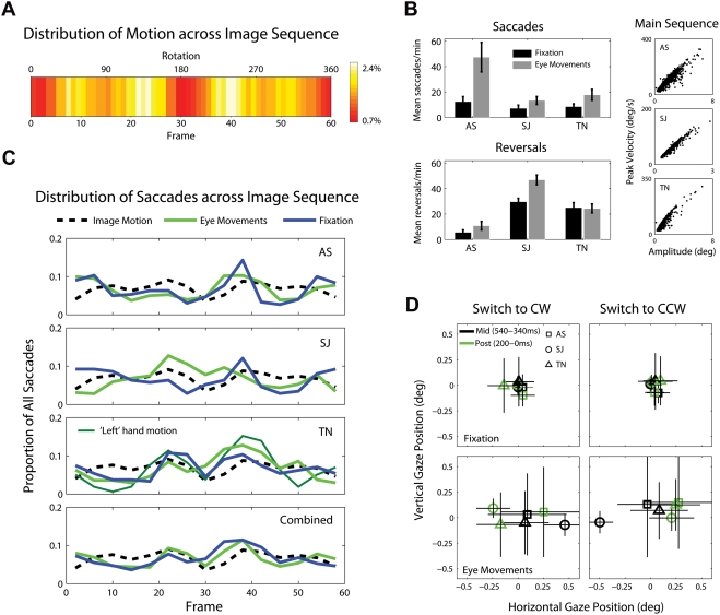
Figure 9. Eye movements and rotation speed.
(A) For each individual dot making up the walker, we calculated the absolute horizontal distance traveled (in pixels) from frame to frame i.e. leftward and rightward motion are treated similarly. Combining the values for all thirteen dots at each frame, and dividing by the total motion in pixels over all frames, gives the proportion of image motion contained between any two frames in the rotation cycle. The colormap illustrates the distribution of image motion across the 60-frame sequence, with brighter values (white) indicating a greater proportion of image motion. (B) Mean saccades/min and reversals/min for each of the three observers, in the fixation (black) and eye movements encouraged (grey) conditions. Error bars represent standard deviations. To confirm that our saccade detection routines performed satisfactorily, we plotted saccade peak velocity against amplitude (i.e. the main sequence [32]). (C) For all saccades made in a particular condition, we calculated the proportion triggered during the presentation of individual frames of the rotation cycle, by noting the frame on screen during the starting sample of the saccade. The blue (fixation) and green (eye movements) lines illustrate this distribution, divided into fifteen equally-sized bins. The black line represents the distribution of image motion across the sequence. Note that the combined histogram data (row four) is not the average of individual datasets, but the pooled saccade data. (D) For each percept reversal, we compared the median fixation positions during two separate time windows prior to the button response: Mid-reversal (540ms-340ms prior to response), during which the reversal is estimated to have occurred, and Post-reversal (200ms-0ms prior to response). Each symbol corresponds to the average over all reversals for a particular observer. Horizontal and vertical lines represent the inter-quartile range along the respective axes. Note than unlike in Experiment 3, both transition types were monitored as normal in each trial. The plots separate the data for each transition type for comparison.

