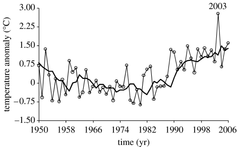
Figure 4.
Temporal trend of the average March–August temperature anomaly in France from 1950 to 2006. For each year, the anomaly is calculated from the base period 1961–1990. The thick curve represents a 5 years moving window (the average temperature anomaly of the 5 preceding years). The year 2003 was the greatest anomaly for the period considered.

