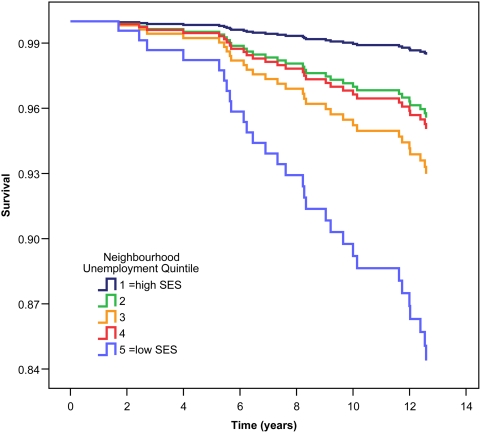
Figure 2. Survival curve for cancer mortality by quintile of neighbourhood unemployment for 485 coronary artery disease patients after 13.3 years follow-up time.
Quintiles of neighbourhood unemployment are relative to 469 neighbourhoods in the province of British Columbia mapped from the Human Early Learning Partnership mapping project, with unemployment data derived from Statistics Canada 2001 census. Higher quintiles represent increasing levels of neighbourhood unemployment. Survival curves are derived from Cox regression survival analyses with adjustment for age, sex, body mass index, and smoking history.

