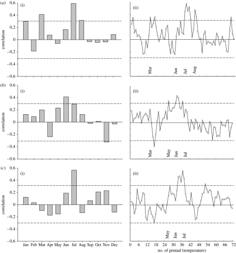
Figure 6.
Correlation plots (1950–1994) between regional RSC chronologies and (i) local monthly mean temperatures and (ii) pentad data of (a) Fennoscandia, (b) Yamal and (c) Avam–Taimyr. The dashed horizontal lines indicate thresholds for correlations significant at the 95% level. See the legend of figure 8 and appendix A for details of the temperature data.

