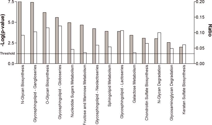
Figure 2.
The top significantly enriched canonical pathways displayed as a bar chart. Significantly enriched canonical pathways were determined using Ingenuity Systems Pathways Analyses and are displayed along the x-axis. The left y-axis displays the negative log of the p-value (gray bars), which was calculated using the right-tailed Fisher Exact Test. The right y-axis displays the Ratio (white bars), which was calculated by the # of genes in a given pathway that meet cutoff criteria, divided by the total # of genes that make up that particular pathway. The threshold for significance is indicated.

