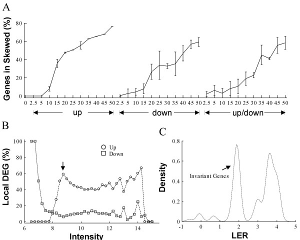
Figure 4.
Positive correlation between the percentages of skewed LER distribution and gene effects. (A) Percentage of genes in skewed local LER distributions along with gene effects for the Dnl data series. The x-axis is the same as in Figure 2. The error bar represents standard deviation computed from 3 replicates. (B) Actual local DEG percentage at each intensity interval. Data used is Dnl simulated with 50% gene effects with an equal proportion of up- and down- regulated genes globally. Black arrow points to the intensity interval used in C. Intensity refers to geometric mean intensity before normalization, which is known as A of a MA plot. (C) Probability density distribution of LER in the interval highlighted in B. LER: logarithmic expression ratio.

