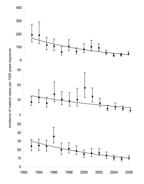
Figure 2.
Change in annual incidence of malaria in the three groups of travellers, graphs show trend plot, mean and 95% CI. The slopes of the 3 curves are not signifcantly different. The top graph is UK residents visiting friends and relatives in West Africa, the middle graph is UK residents in West Africa for other reasons, the bottom graph is West African residents visiting the UK.

