
Fig. 1.
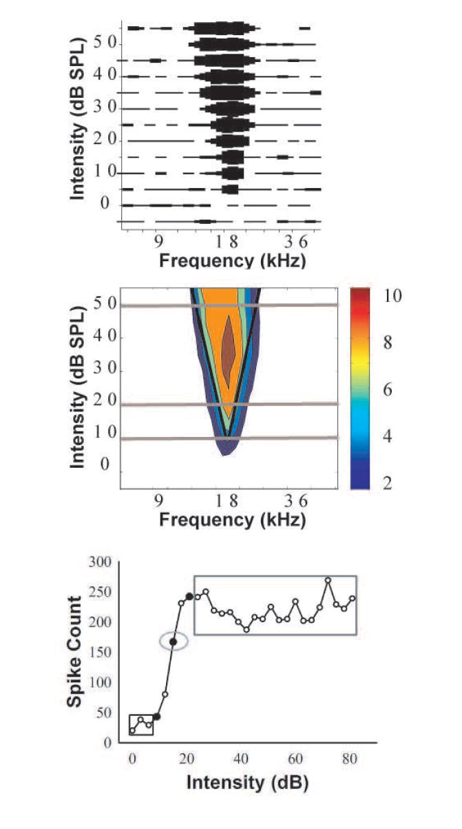
a) This is the raw FRA of an IC unit from a 2-mo-old NH C57 mouse. Driven activity is depicted by the thickness of the line at each frequency/intensity combination, and narrower lines indicate fewer spikes. In this example, the thickest bar represents 12 spikes. b) The smoothed FRA following automated analysis (see Methods) with the number of spikes indicated by color (color bar legend is shown to the right, and the maximum smoothed spike count is 10). The black lines indicate the best fit regression through the low- and high- frequency cutoffs, and define the driven response. These lines intersect at the CF. The gray lines denote the intensities representing the threshold, 10 dB above threshold, and 40 dB above threshold, and are extended beyond the FRA in order to increase their visibility. c) A sample RIF demonstrating the 3 intensity and 3 count measures obtained from each neuron. The 10% intensity is indicated by the leftmost filled circle, and the counts elicited by each of the three intensities below the 10% intensity, enclosed by the black rectangle, are averaged for the minimum count. The 50% intensity is indicated by the middle filled circle, and the spike count elicited by this intensity, enclosed by the gray oval, is the 50% count. The 90% intensity is indicated by the filled circle to the left of the 50% intensity. The counts elicited by each of the 20 intensities that were greater than the 90% intensity are enclosed by the gray rectangle, and these were averaged to yield the maximum count.