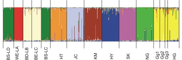
Figure 1.
Clustering diagrams of the 14 chicken populations and the reduced sample of the Ha Giang chickens obtained for K = 10. Each individual is represented by a vertical line, which is partitioned into K = 10 colored segments that represent the individual's estimated membership fractions in K clusters using the Q matrix of the run with the best similarity. Black lines separate individuals of different populations coded as defined in Table 1.

