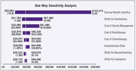
Figure 1.
Tornado diagram of the one-way sensitivity analysis indicates that the outcome is most sensitive to variation in the expected survival benefit, and least sensitive to variation in the utilities for nausea/vomiting and leukopenia. Dollar amounts indicate the incremental cost per quality-adjusted life year; brackets contain the upper and lower values for each input.

