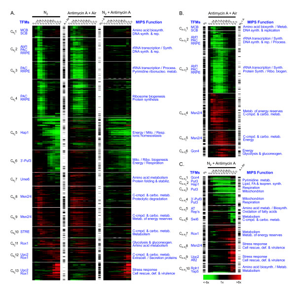
Figure 3.
Transcript heat maps and statistical comparisons of genes that significantly responded to anaerobiosis (A), antimycin A treatment in air (B), and subsequent anaerobiosis in the presence of antimycin A (C). The temporal profiles of genes whose transcript levels responded significantly (P ≤ 0.01) to each treatment were clustered separately using Kohonen's SOM algorithm with 1D string topology and standard correlation as the distance metric. Appropriate K values for gene network discovery were determined by evaluating CS and FCS using a range of K values (2 – 30) (see "Materials and Methods"). Figure 3A compares the response of all genes that significantly responded to anaerobiosis (N2, far left) to their response to antimycin A treatment in air (middle panel) and to subsequent anaerobiosis in the presence of antimycin A (right panel). Note that only those genes denoted by a black bar responded significantly to the indicated treatment (A + Air = antimycin A under aerobiosis, N2 + A = antimycin A under anaerobiosis, and N2 = anaerobiosis). The blue text is an abridged list of transcription factor motifs (TFMs, left) and MIPS functional categories (MIPS Function, right) that were significantly (P ≤ 0.01) overrepresented in each gene cluster. Panel B shows the clustering results for all genes that significantly responded to antimycin A treatment in air while panel C shows that for those significantly responded to anaerobiosis in the presence of antimycin A. The time scale is the number of generations after the indicated treatment.

