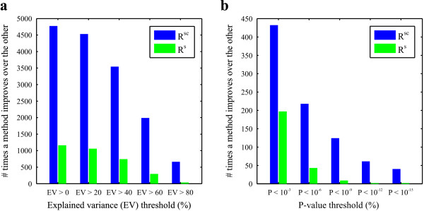
Figure 4.
Comparison between the regression analysis including including both the single and the combinatorial effects (Rsc) and the regression analysis including only the single effects (Rs). a: Histogram plot indicating how many times one method (Rsc or Rs) leads to a higher percentage of explained variance (EV) of a gene given that the EV of this gene is larger than the EV threshold (x-axis) for at least one of both methods. b: Histogram plot indicating how many times one method (Rsc or Rs) leads to a higher enrichment value (lower p-value) for a functional category given that the enrichment of this category is below a p-value threshold (x-axis) for at least one of both methods.

