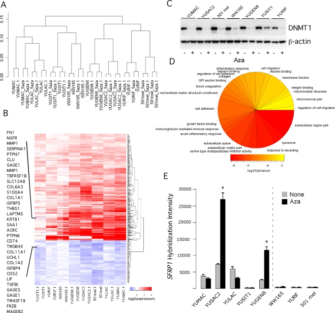
Figure 2. Bioinformatic analysis of whole genome expression arrays.
Panel A. Unsupervised hierarchical clustering of absolute intensity values. The vertical scale indicates 1-pearson's correlation coefficients as a measure of similarity. Panel B. Heatmap of differentially expressed sequences after treatment with low-dose Aza. Panel C. DNMT1 expression at the end of 3-days treatment with Aza (0.2 µM). Cell extracts were subjected to Western blot with anti-DNMT1 antibodies. The same membrane was successively blotted with anti-b-actin antibodies as a measure for protein load in each well. Panel D. Pie chart of the most over-represented Gene Ontology terms (p-value<1e-3); the size is relative to the number of represented genes, and the color represents the enrichment p-value. Panel E. SFRP1 transcripts in melanoma cell strains as assessed by the oligonucleotide array hybridization. The data represent one of two sequence IDs with similar results. The error bars represent the Standard Deviations (SD). One, two, three stars refer to p-value less than 0.05, 0.01 or 0.001, respectively. We determined p-values by unpaired t-test (Aza vs. Untreated). The broken line in this and all subsequent figures separates sensitive (left hand side) from resistant (right hand side) cell strains.

