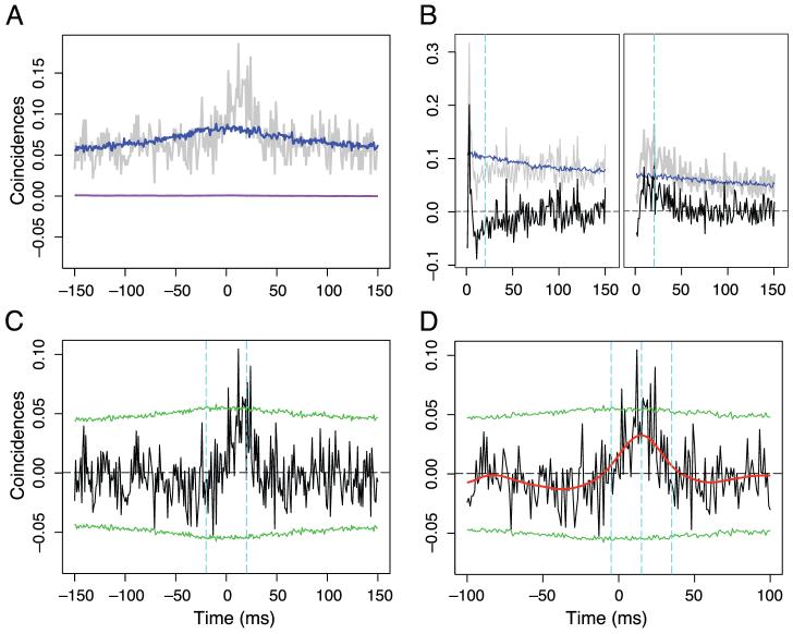
Figure 3.
Example cross-correlation analysis. In this example, data of all the stimulus conditions are pooled together. (A) Gray curve, the cross-correlogram function; blue, the shift predictor; purple, the excitation covariogram. (B) auto-correlation function of the two neurons. The zero bin of the auto correlation function point exceeds the range shown and was not plotted. Gray, raw auto correlation function; blue, shift predictor; black, auto correlation function corrected for shift predictor. The dashed cyan lines mark the half integration width. (C) Calculation of the strength of synchrony. Black, ECC curve; green dotted lines are 2 standard deviations from the mean of the ECCs generated by randomization (see Materials and methods). The two cyan lines mark the integration interval for strength of synchrony. (D) Calculation of the strength of correlation. Black and green lines are as in C. The red line is the ECC smoothed with a Gaussian filter of standard deviation 10 ms. The middle cyan line marks the peak of the smoothed ECC. The other two cyan dashed line mark the integration width.

