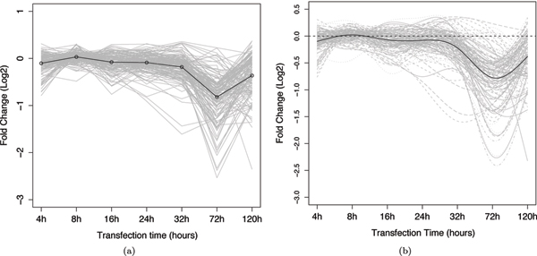
Figure 3.
Profiles of gene expression of the indirect-target training set. Each grey line represents the expression change (y-axis) of one gene across the 7 time points (x-axis). The black line represents the mean value of the curves. (a) plots the linearly interpolated observed data, and (b) plots the corresponding functional data smoothed with B-spline basis functions.

