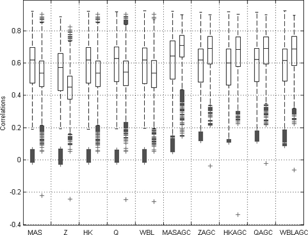
Figure 3.

Boxplot of distributions for two sets of correlations from data normalized with each normalization method. The left values are correlations between samples from same array generation within different anatomical class. The right values are correlations between samples within the same anatomical class but with different array generation. All the 1,464 healthy samples were used in this comparison. When the AGC method was used, the mean value of the correlations between samples from the same anatomical class but different array generations were significantly higher than the mean of the correlations between the samples from same array generation but different anatomical class.
