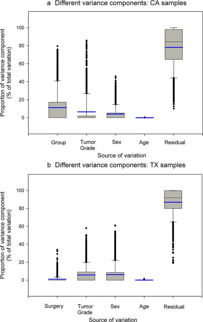
Fig. 6.
Assessment of sources of variation in metabolomic profiles. Box plots of relative magnitudes of different sources of variation are shown for CA samples (a) and TX samples (b). The proportions of different variance components are shown on the y axis. The blue line represents the mean. The box is drawn from the 25th to 75th percentiles in the distribution of proportions of each variance component. The median, or 50th percentile, is drawn as a black horizontal line inside the box. The mean is represented by the blue horizontal line inside the box. The whiskers (lines extending from the box) describe the spread of the data within the 10th and 90th percentiles. The dots display any points beyond the 10th and 90th percentiles.

