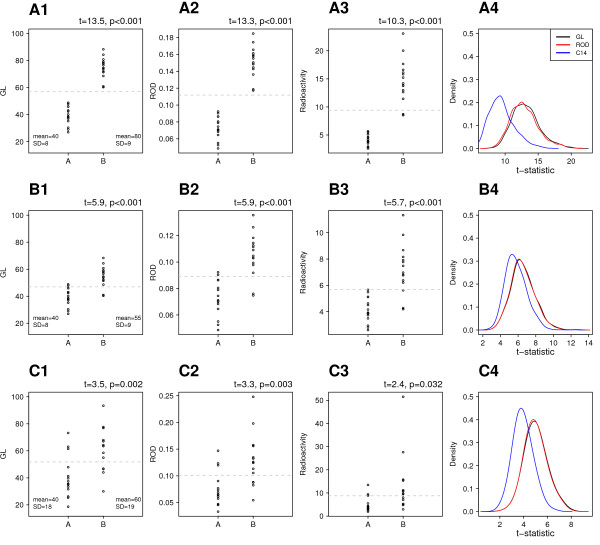
Figure 7.
Effect of transformations on simulated data. Data in the first column are the simulated grey level values from various distributions. Note that the y-axis is the same in these three panels so the data can be compared directly. A1 has a large difference between means and low variability, leading to no overlap between data points. B1 has similar variability as A1 but the difference in means has been decreased by half, leading to overlapping values between groups. C1 has the same difference in means as B1, but much greater variability. Horizontal grey lines are the grand mean and can be used as a visual guide to compare the distribution of data points under various transformations (across rows). Converting to ROD has little effect on the statistical properties of the data, while converting to units of radioactivity badly skewed the data, created outliers under certain conditions, and leads to decreased power (see text for details). This is highlighted in column four where the t-values for the radioactivity data (blue line) are shifted to the left for all three datasets.

