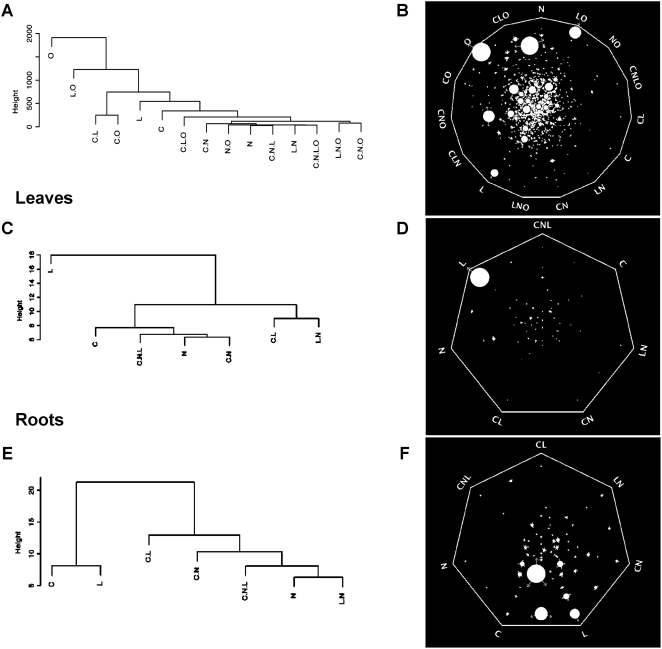
Figure 3. Signal strength and relationship for the control of gene expression.
A, B) Analysis using the entire data set; C, D) Analysis using data from leaves; E, F) Analysis using data from roots; A–C) Dendrograms produced by average linkage hierarchical clustering analysis with euclidean distance carried out on the simplified model matrices as described in the text. B–F) Analysis of signal strength using the Sungear software. The Sungear polygon shows the signals at the vertices (anchors). The circles inside the polygon (vessels) represent the genes controlled by different signals as indicated by the arrows around the vessels. The area of each vessel (size) is proportional to the number of genes associated with that vessel. Thus, it is visually and quantitatively possible to identify the main signal at the whole dataset level as O. In leaves, L predominates, and in roots C and L are similar with regard to the number of genes affected. See details for interpretation in Materials and Methods.

